UX/UI Design
Art Gallery of Alberta
Creating an innovative online experience
Role: Lead UX/UI Designer
Agency: Box Clever
Client: Art Gallery of Alberta
Awards Won: Web Excellence Award (Season 14)
The Art Gallery of Alberta (AGA) is a gallery located in Downtown Edmonton and is focused on connecting art, people, and ideas. As the lead UX Designer for the redesign of the art gallery’s website, our goal was to completely redesign AGA’s digital presence in time for their 100th anniversary.
My goal was to design a cleaner, more intuitive experience that would highlight all the gallery has to offer, which includes exciting art exhibitions, art rentals & sales, event spaces, shops, weekly events and more.

Discovery & Research
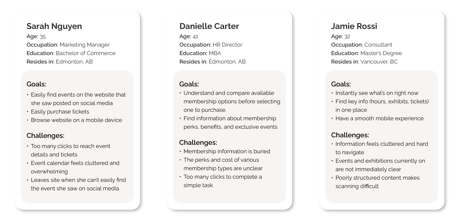
After conducting stakeholder and user interviews, completing a competitive analysis, and determining user personas, common objectives and pain points begun to emerge.
Audience
Decision makers for family outings
Culturally engaged professionals
Tourists looking for timely and current events
Website Pain Points
Overly complex navigation and cluttered homepage
I wanted to address the user journey and reduce the number of clicks required to find key actionsUsers overwhelmed with too much information
How to improve the organization and layout of content had to be looked at to ensure the website was intuitive and user-friendlyOutdated and not inclusive
The overall visuals of the website needed an overhaul to better engage users and meet current accessibility standards
UX Strategy
Simplifying the User Journey
Utilizing target audience personas, we analyzed existing user flows and identified key pain points. These pain points were particularly around the events calendar, membership signup, and art sales & rental. To address these issues, the UX flow was revised to prioritize:
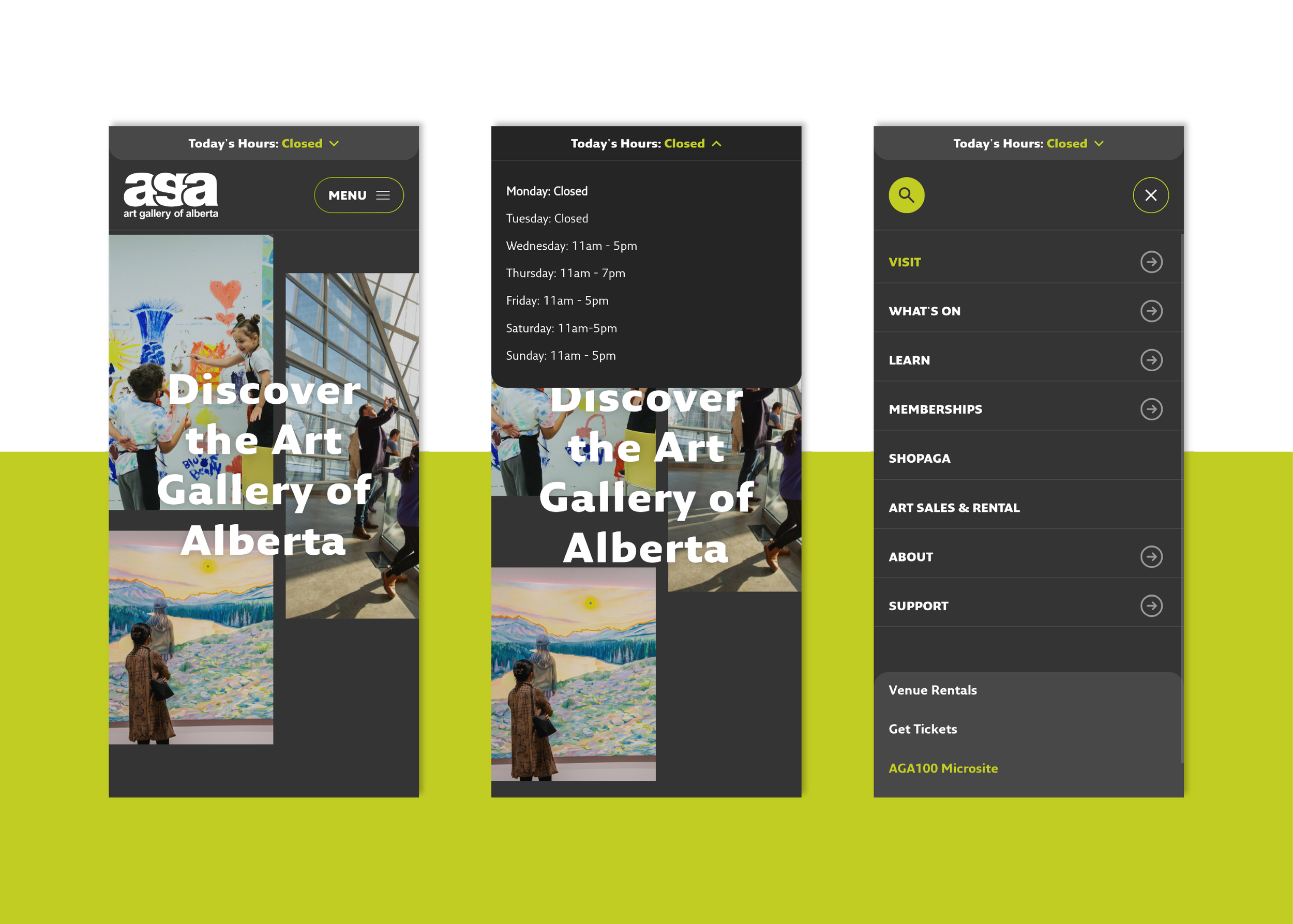
Clear CTAs and One-click Access to Key Actions
Essential actions and key call-to-actions such as “Become a Member”, “Buy Tickets,” “See Hours,” and “Donate Now”, were moved from the footer to top-level navigation and are present in highlighted locations through the website,Content Restructuring
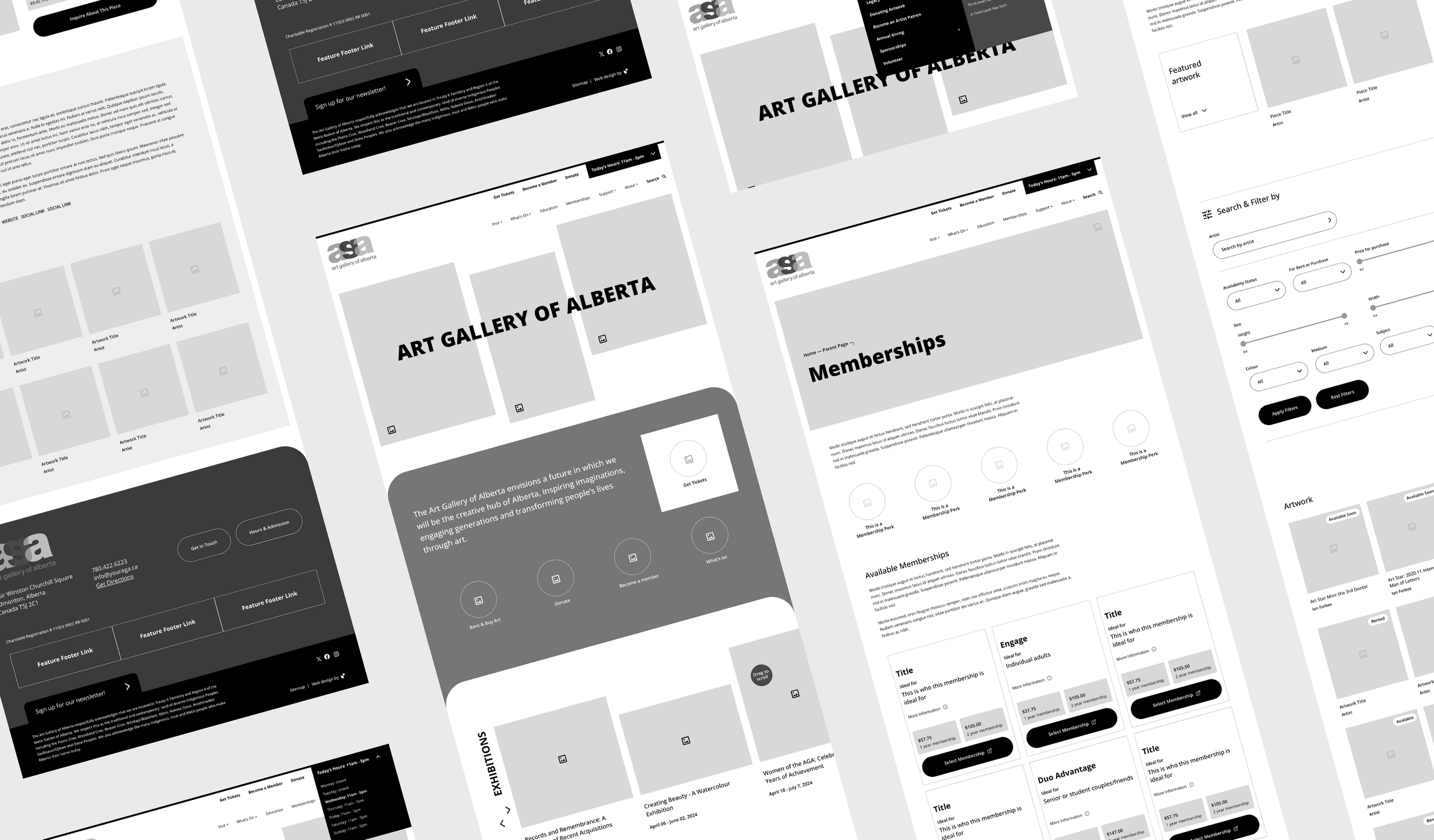
Clear navigation items were proposed that focused on user intent to streamline the user journey. Revised page layouts were designed to provide the client with a clean and intentional way to layout content, and highlight important information.Reimagined Key Pages
To eliminate pain points as discovered within our research, custom page layouts were created to address website usability and dropoff rates. (eg. Home, What’s on, Memberships)

Designing for Usability and Clarity
Through user interviews and usability testing, findings were compiled from various groups that determined a full revamp of layout and content structure was required for many key pages.
Home
An engaging homepage was created with the key features in mind: Visually showing off current art and art exhibits at the gallery, featuring call-to-actions highlighting exhibitions and programs front and center, ease of use to buy tickets or memberships, and see hours.What’s On
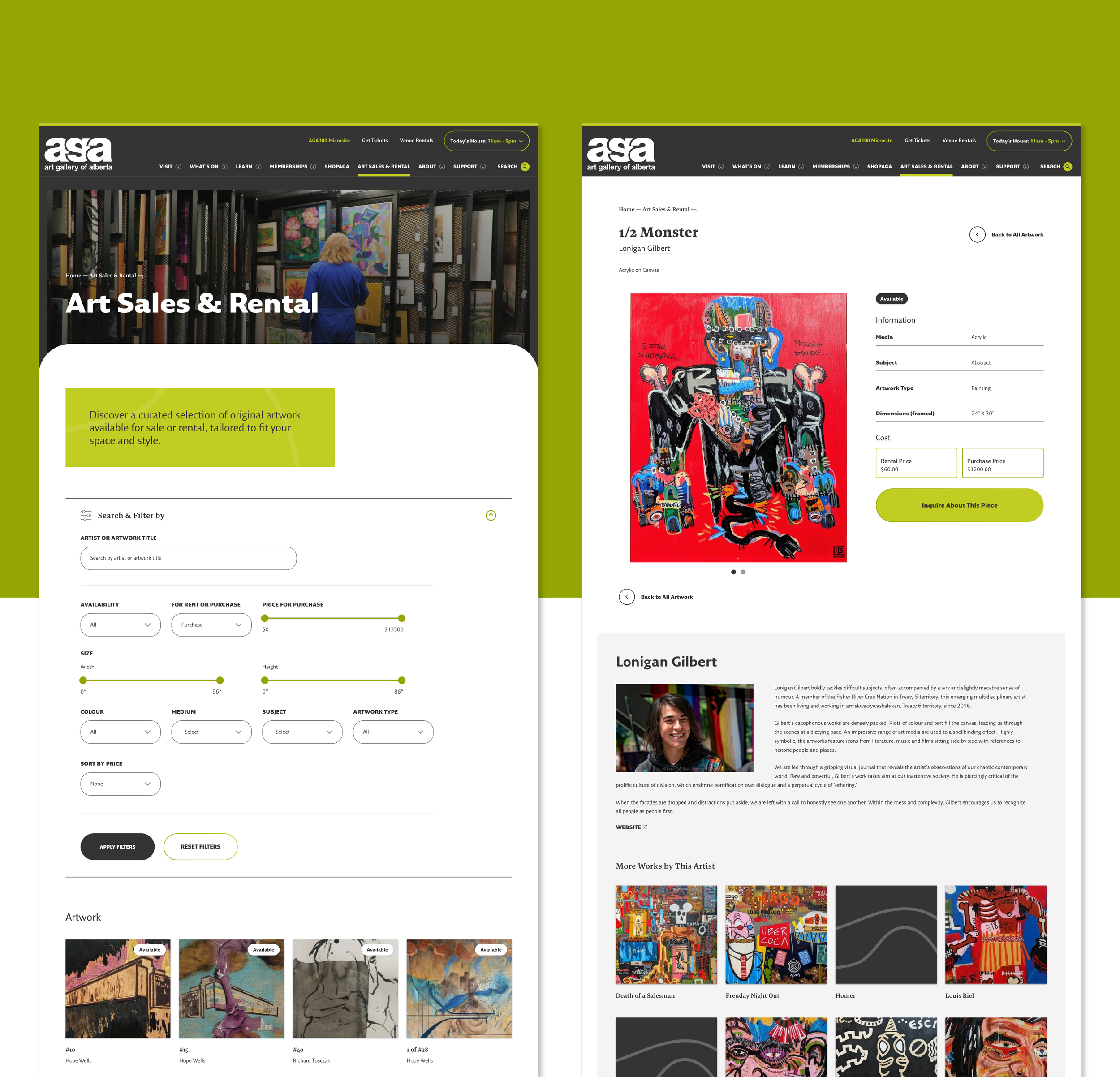
Merged separate templates and sections for events, exhibitions, and programs into a single, dynamic “What’s On” page including an easy to use filter.Art Sales & Rental
An enhanced filter system was introduced to allow users to easily narrow down what type of artwork they are looking for. Along with a revamped layout on the main listings page providing key information at a glance (such as current availability), the interior artwork page was also updated with a new layout and content structure providing information clarity.Memberships
While integrating the memberships with an external system for purchasing was key, a visually engaging and user friendly landing page on the main AGA site was designed to provide users with information on the memberships offered. Visual icons and restructured content are present to ensure the membership options can be absorbed easily by the user.


An Innovative Look and Feel
The AGA needed a reimagined digital experience not only when it came to content structure and user journey, but also visually!
Clean, Crisp, Innovative, Creative
With key words in mind, the AGA brand was applied and expanded upon to create an engaging and exciting experience for website visitors while being user friendly and following accessibility standards.Tasteful and Engaging
To continue enhancing the user experience, tasteful animations and microinteractions were utilized throughout the website to create a dynamic and engaging visit.Highlighting an Iconic Building
Along with a well established and recognizable brand, the Art Gallery of Alberta’s home is situated in an iconic building in downtown Edmonton. Combining clean linework, along with organic curves mirroring the architecture style of the building, the essence of the AGA building itself can be found within the website.Custom Icons and Illustrations
Utilizing a linework style inspired by the building architecture, custom icons and illustrations were created to be highlighted throughout the site to expand upon the already established AGA brand and provide an immersive visual experience.

Highlighting the architecture of an iconic downtown Edmonton building with custom icons and illustrations.
Conclusion
The redesign of the gallery’s website successfully addressed key business goals by simplifying the user journey, improving information architecture, and creating a visually engaging experience that streamlines key actions. Ultimately, the redesign not only improves the user experience but also strengthens the gallery’s digital presence ensuring that users can easily navigate and engage with the site,
By understanding the needs of both the organiation and its users, we created a positive site experience that reflected the goals of both groups.
Winner of a season 14 Web Excellence Award.
